This is the front of my CD cover design. I wanted to represent the stereotypical style of an 'Emo' Band. Therefore needed a gothic, dark Image.
I took a picture of myself and manipulated it in Gimp. It needed to be dark and striking like the music so I made it a close up of eyes. I then altered the images color so that the eyes were heterochromia thus showing the creepy unique style of the music. It also plays with the bands name as heterochromia is a rare disease. I wanted all the focus on the eyes so I brightened the colors and added darked eyeliner useing the paintbrush tool. Then used contrast to fade out any other features, and further enhance the eyes. The image represents the band because it is in the style of 'Emo' A black fringe and dark eyeliner for a disturbing yet pretty image. It will appeal to young people from about 13-26. Because It features a young girl on the front and also the style is 'emo' is mostly worn by that age group.
I chose the font because it was stylish yet had a slanted twist, I used a fliter to get a blurred verison coming in to focus.
Below is screenshots from each process:-

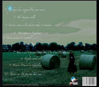
This is the back of my cover.
It is very dark, and spooky again using the stereotypes of emo.
I used hue to change the overall color to an un-natural green/Blue colour. Which is sickly and cold. This conveys a more serious yet stilll dark tone. It's how the band want to be represented. I manipiulated the contrast to add further darkness. You can't see the girls face which adds to the mysterious feel of the band. The reaching hand is like she wants to infect you to. The stereotype of emo, is fullfilled by the idea of death and a rejected person. I copied and pasted the bar code and record company lable. So It would be more authentic.
Screen shots are again below:-